Abstract
This article develops a method for comparing the redistribution effects of tax-benefit schemes using summary statistics and graphical displays. As an illustrative application, it then compares four revenue-neutral Citizen’s Income schemes constructed in Euromod, using 2009 data.
Introduction
Whilst income redistribution may not necessarily provide the main motivation for the adoption of a Citizen’s Income (CI) per se, some redistribution is inevitable, the nature of which will depend on such factors as the level of CI and the corresponding tax rates. The type and degree of redistribution may be a political constraint on the institution of a CI and will certainly be of interest to any government that considers doing so. In particular, we recognise that some groups will experience a fall in their disposable income as a result of a CI being introduced, which may undermine its political feasibility. We seek to develop a means of examining and comparing the disposable income losses of proposed tax-benefit schemes in general and CI schemes in particular. We then discuss the construction of redistribution-minimising CI schemes and proceed to use these techniques to compare a number of CI schemes simulated in Euromod, (a tax-benefits microsimulation programme developed by the University of Essex), using 2009 UK data.
Basis of Comparison
For the tax payer and benefit recipient, i.e. the citizen, the primary outcome of social security policy is disposable income. A new tax-benefit scheme will affect the individual in the first case only by how it affects the level of disposable income. Thus we make the 2009 UK tax-benefits system the basis of comparison and refer to it hereafter as the base scheme. Two schemes are compared, by calculating the disposable income of households of individuals under each, and comparing them to the base scheme. For instance, if I have disposable income of £100 under the present UK tax-benefits scheme, £90 under proposed scheme A, and £105 under proposed scheme B then we can compare schemes A and B by saying: scheme A induces a 10% loss vis-à-vis the base scheme, whilst scheme B induces a 5% gain. This is different from concluding that I am 17% better off under B than A.
An important feature of CI schemes is that the individual becomes the basic unit of receipt. However, for these exercises I will compare household disposable incomes for the following reasons: i) the individual’s spending power is most often determined by household income, so the practical redistributive consequences will be best seen by examining households; ii) in households where one individual receives benefits for the whole household under the base scheme, these benefits will be more equally distributed amongst all members of the household under CI schemes, such that one individual will make substantial losses and others substantial gains within a single household, leading to high intra-household redistribution, whereas the household may in fact have the same disposable income in both cases; iii) many individuals have zero disposable income, making analysis of percent changes in income impossible. Rather than remove these individuals from the sample or develop more complicated methods of analysis, we can use data for households, very few of which have zero disposable income. In short, using household data is more representative of real life, ignores redistribution within houses, and allows for easier analysis.
However, a more thorough analysis of redistributivity would require looking within households to see who is gaining and who is losing, for example whether it be pensioners, families, or working-age couples.
Measures of Losses
Suppose we have a large data base of household disposable incomes under the base scheme and some other scheme A: for each household we have a unique identification number, id, a disposable income in pounds over some period under the base, Ydbase, and a disposable income over the same period under A, YdA. Let us suppose that disposable income is measured monthly, a line in this database may appear as follows:
[table id=14 /]
In this example we see that household 43091 stands to lose £83 per month under scheme A. Since £83 can mean very different things across the income scale, it is more descriptive to calculate this as a percentage; in this case we see that the household loses 4.4% of disposable income per month under scheme A.
It is true that minimising losses and minimising gains are equivalent in a revenue neutral model, but we concentrate on losses because these are more politically threatening than gains. For this reason we take only the negative proportionate differences, square them and then sum to give the SumSquares statistic: let Ydbase(i) and YdA(i) be the disposable income of household i under the base scheme and scheme A respectively, and Ydbase be the mean household disposable income under the base scheme, then
SumSquaresA = [Sum] (YdA (i)-Ydbase(i)) sq / Ydbase sq
where we sum across households i with Ydbase(i) > YdA(i) only. Squaring the proportionate loss weights high proportionate losses more than low proportionate losses; for instance, decreasing 0.15 to 0.14 reduces the statistic by 0.152-0.142 = 0.0225 – 0.0196 = 0.0029, whereas decreasing 0.14 to 0.13 reduces it by 0.142-0.132 = 0.0196 – 0.0169 = 0.0027. To weight high losses more heavily, we can use sums of higher powers. Including households with positive changes in income would mask whether a large SumSquares statistic was induced by a large number of heavy losers or a large number of heavy gainers. As it is, in comparing two schemes, A and B, the result that SumSquaresA > SumSquaresB allows us to conclude that ‘other things equal, scheme A induces greater proportionate losses in household disposable income than scheme B’.
We saw how the SumSquares statistic weights high proportionate losses more heavily than low proportionate losses. We may wish to weight losses by poorer households to give an income-weighted statistic, WeightedSum, as follows: for a scheme A,
WeightedSumA = [Sum] (YdA (i)-Ydbase(i))exp((Ydbase – Ydbase(i))/1000)
again summed across households with negative changes in disposable income. This formulation is a bit arbitrary. The income weighting is given by the exponent. Households below mean income give a positive argument, [note]Given a function f, the argument is the number (which may be a second function) to which the function is applied, i.e. g in the case of f(g) or (mean base disposable income – base disposable income)/1000) in the case of the exponent above[/note] so the exponent will be big (larger than 1, and increases rapidly as income falls further below mean income), whereas households above mean income yield a negative argument, giving an exponent less than 1, i.e. they might as well not count. Dividing the argument by 1000 eases computation with the effect that high and low earning households will be brought closer together in the weighting: if one household earns 2000 below mean income, and another 2000 above mean income, exp(mean income-income) gives exp(2000) and exp(-2000) respectively, their difference is big, about exp(2000) in fact, since exp(-2000) is negligible, whereas dividing by 1000 gives exp(2) and exp(-2) respectively, with difference approx. 7.25, which is far more manageable. Furthermore, this division makes the effect of above mean income households almost discernible: exp(-2000) =approx 0, exp(-2) =approx 0.135.
In comparing two schemes A and B, WeightedSumA > WeightedSumB allows us to conclude that scheme A induced higher proportionate losses in poorer households than scheme B.
To summarise, minimising the SumSquares will minimise high proportionate losses generally, whilst minimising the WeightedSum statistic will minimise high proportionate losses amongst low-income households. However we only consider them ordinally to say that if, for example, scheme A has weighted sum 4000 and scheme B has weighted sum 2000, then A takes more from poor households than B; it does not follow that A takes twice as much as B. Moreover, these statistics are only valid in comparing schemes of the same cost. If B costs more than A, we’d expect households in A to lose more than B, even if A is in fact less redistributive than B. (The ‘cost’ of a scheme means the difference between welfare spending and tax receipts, i.e. the amount financed by borrowing. In the short term this borrowing constitutes foreign wealth entering the economy, thus households are better off (until they have to repay the public debt). If B costs more, households must make a net gain over A, i.e. they lose less.)
Gains and Losses by Disposable Income bracket
We may wish to consider gains and losses within different income ranges. Ten disposable income brackets are chosen such that approximately 10% of the sample lies in each bracket under the base scheme. The Euromod data used later gives the following brackets for mean monthly disposable income:
[table id=15 /]
(the upper bound is base disposable income, £/mth)
We see, for instance, that 10% of the sample has a disposable income of less than £720 per month, whereas 10% have more than £3910 per month.
Now we can examine the effect of any given scheme by calculating the following:
- The change in the size of each bracket. If lower income households are better off under a scheme then the number of households in lower brackets will fall; though if the size of a middle range income bracket falls, it is not clear whether these households are moving into a higher or a lower bracket.
- The percentage of households in each bracket gaining or losing a given percentage of income. This allows us to see how gains and losses are distributed across the income scale.
These can be displayed in a table:
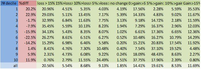
[table id= 16 /]
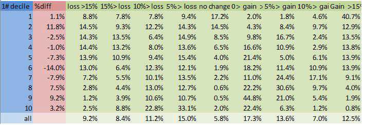
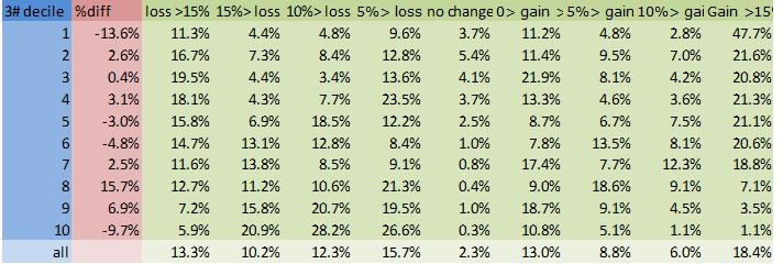
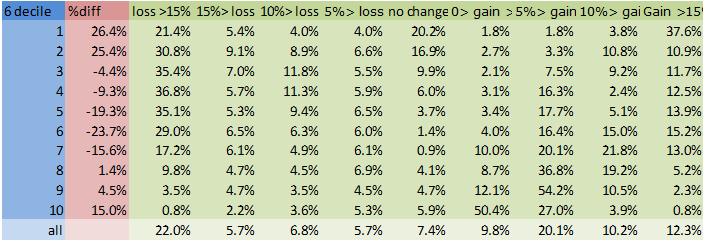
In this example we see that under scheme 7#, the number of households in the first income bracket increased by 20.2%, that 20.96% of households lost more than 15% of their income, 4.51% lost between 10 and 15% of their income etc..
Graphical Comparisons
The tables and graphs will be found at the end of the article
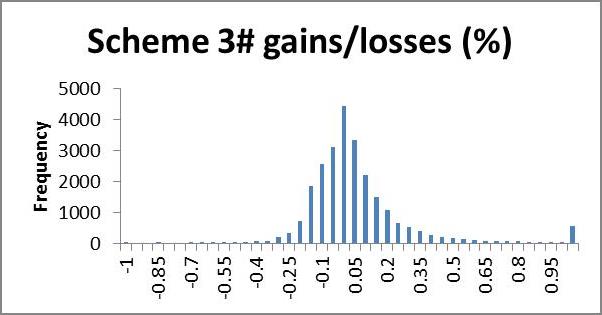
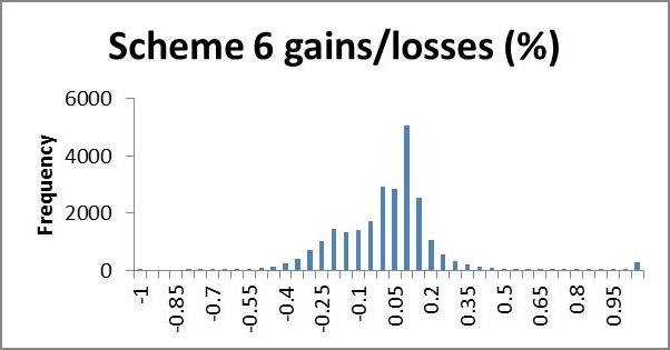
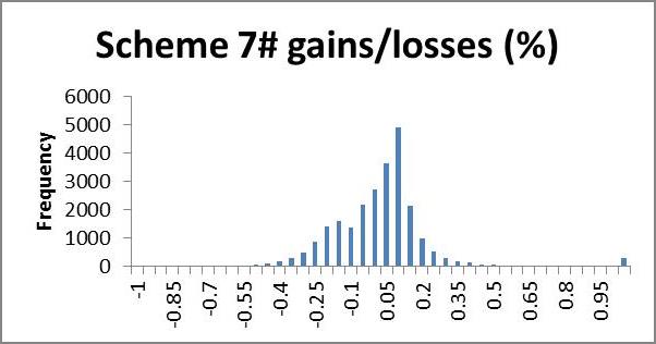
We may wish to examine the number of households losing a certain percentage of income; a histogram is a useful way to present this information quickly by showing the number of households gaining or losing a given range of percent disposable income. In the following application, very few households lost more than 100% of their income, whilst many gained more than 100% (even up to thousands of per cent). We use 5% brackets from -100 to +100%, and households outside this range are counted in a single category >(<-)100%. This gives a clear representation of what percentage of their income most households gain or lose; we expect that most households will lie in the centre, having very small gains or losses, with fewer at the extremities making larger gains or losses, producing an approximate bell shape curve. A scheme giving low redistribution will show clumping in the middle, i.e. a tall bell (high kurtosis); high redistribution will appear more elongated, i.e. flatter bell (low kurtosis). If we are interested in minimising losses we look for a short and flat tail to the left (positive skew) and necessarily high kurtosis (since the scheme is revenue neutral the area left of zero must equal the area to the right, so if we cut short the left tail, the negative area must be clumped near the zero, giving high kurtosis). In future research it would be nice to model a probability density function from the histogram for easier analysis.
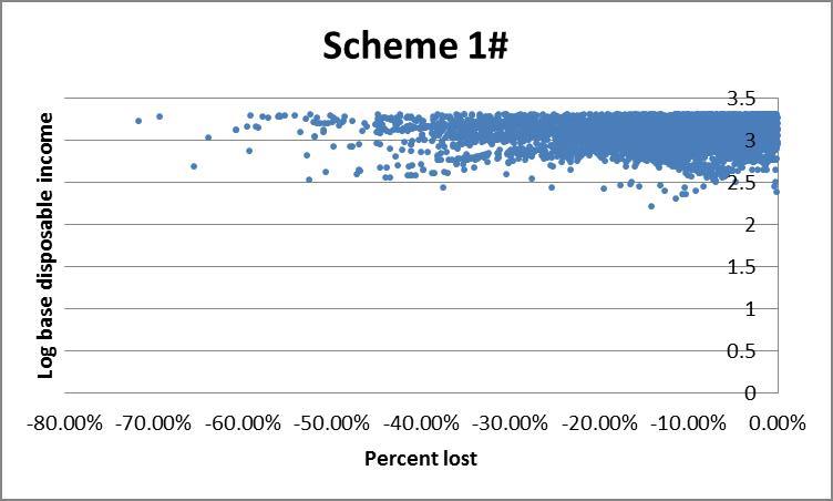
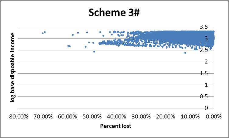
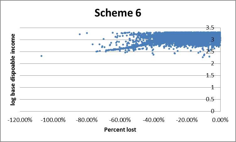
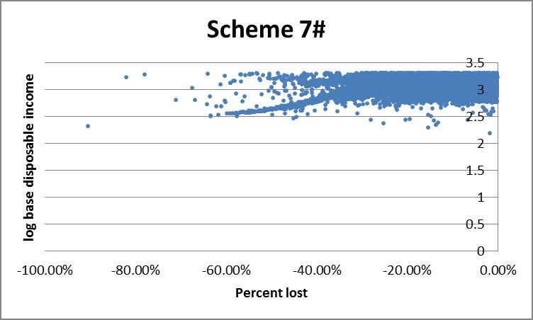
However the histogram does not allow for us to see who is gaining or losing, for example whether they are rich or poor. An alternative is to plot income against percent change in income under a given scheme. The presence of very high income outliers causes ‘normal’ income households to be clumped too tightly to distinguish high from low income households on a linear axis. To rectify this we use log disposable income (see the appendix) which effectively draws the higher incomes closer together, making lower incomes more distinguishable. This comes at the expense of losing negative income households since the log of a negative number is non-real. For the same reason we exclude households with positive changes to income.
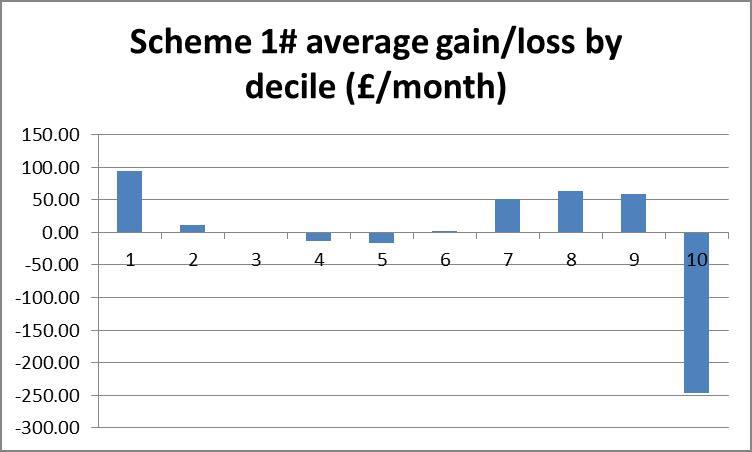
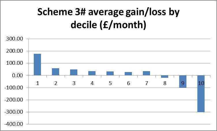
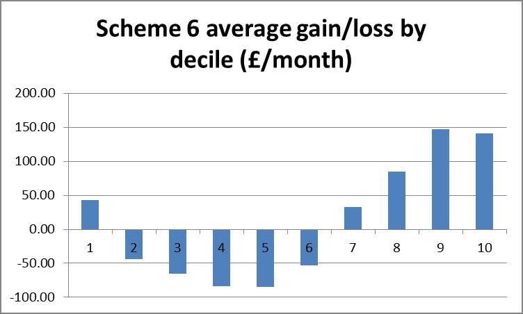
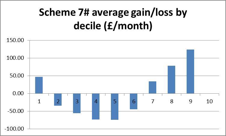
To get a rough picture of how changes in income vary across income brackets we can plot a bar chart of the average absolute change in income of each bracket. If a scheme is revenue neutral then the area of the bars above the zero-line should be equal to that below it. The smaller the area, the lower will be the amount of redistribution, but if some brackets must gain and others lose, we might prefer that lower brackets gain and higher brackets lose, producing a negatively sloping straight line over the bars.
Application
Euromod [note]Euromod F5.0+ was employed, using Family Resources Survey 2008 data[/note] is a tax-benefits simulation programme developed by the University of Essex which allows us to input our own tax-benefits rules and simulate the effect on individual and household finances for a given data set. These experiments were conducted using UK 2008 household survey data from a sample of about 60,000 households. Five households were dropped from the sample since they had no interaction with the tax-benefits system whatsoever. The base model we use is the UK tax-benefits system as of 2009. For this and any CI scheme, the Euromod output gives average disposable income per month of all the individuals and/or households in the sample, and details of how much income each unit earns, receives in benefits, receives in means tested benefits, and pays in tax. Of these we have only considered disposable income, but looking at other variables could also be insightful.
It should be noted that Euromod gives a static simulation, i.e. it does not take into account endogenous changes in labour supply. This places CI schemes at a disadvantage since many of the proposed savings from CI come from increased incentives to work amongst benefits recipients, and these will not be modelled. Neither does Euromod model administrative savings, informal economic contributions, or enterprise, all of which will be substantial under CI.
We applied the method outlined above to a number of different CI schemes of which four are compared here. As an exercise we look for a CI model which gives as similar as possible a practical outcome as the base, differing only in administration. Besides revenue neutrality, this requires that redistribution be minimised. We first discuss what principles such a scheme might be based on.
Constructing a scheme
The sample contains 13,613 children (strictly under 18), 9,987 pensioners (65 and over), and 33,676 working age adults (18-64).
To minimise redistribution, we set the CI equal to zero and leave the tax system as it is, i.e. do nothing. This gives zero gains and losses but also achieves nothing. We see that the greater the CI, the greater the gains and losses. To constrain our problem we must introduce some minimum effective CI for each demographic group, and in fact in minimising redistribution we will have no reason to exceed this minimum. Clearly £1/wk is not a very interesting case to examine, whereas £70/wk is. We propose examining CI in this range.
In the ‘perfect’ scheme with zero losses, each household will pay for its own CI either in forgone means tested benefits or else in extra tax. For those receiving means tested benefits exceeding the CI this should be easy to achieve since the value of the CI will simply be deducted from those benefits. For those in work the calculation is more difficult since we would need to set a unique tax rate for each individual to cover their CI. In fact we are helped by the existence of the Personal Allowance which will have equal worth for everyone whose earnings exceed it. This can then be used to partly fund a CI without loss. For under 65s, we get £6475*0.2 = £1295 pa = £25/wk; for 65-74s, £9490*0.2 = £1898 pa = £36/wk; and for over 75s we have £9640*0.2 = £1928 pa = £37/wk. So for this group (which will be big for working age people but much smaller for pensioners), CIs of £25/wk and £36/wk would result in no net losses. Those earning below their personal allowance would gain, which would require some other adjustment to maintain revenue neutrality, unless they cover the cost in foregone benefits. Child Benefit stands at £20/wk in the base, so replacing this with £20/wk child CI would change nothing. This may suggest a scheme which offers £20, £25, £36 CI for children, working age adults and pensioners respectively, though these numbers may seem a bit too low to be interesting.
CI replaces Working and Child Tax Credits in all of these schemes, so working families need be compensated for this to minimise losses.
Ways of funding higher CI include equalising the retirement age, raising Income Tax rate, changing Income Tax thresholds, and abolishing the upper earnings limit for National Insurance Contributions.
Example Schemes
Below are details of a number of schemes, each accompanied by its cost summary statistics and graphs.
Base (2009) scheme: JSA at £64.30/wk for over 25s, £50.95 for 18-24. Personal Allowance at £6475 for under 65s, £9490 for 65-74, £9640 for over 75s, and married couple over 75, £9795. Income Tax threshold 1 £2440/yr, threshold 2 £37400/yr. National Insurance Contribution basic rate 11%, lower threshold £110/wk, upper threshold £844/wk, National Insurance Contribution 1% above the upper threshold. Child Benefit £20/wk first child, £13.20 thereafter. Income tax 20% first band rate, 40% second band rate. Tax credits included. No CI. Retirement age, 65 men, 60 women.
Scheme 1#: Tax Credits replaced by CI: £56, £59, £120/wk for children, working age adults, pensioners respectively. Personal allowances abolished, contributory JSA abolished. Women’s retirement age increased to 65 in line with men’s. Upper NI limit abolished. Income tax first band 25%, second band 35%, third band from £40,000 threshold at 45%.
Scheme 3#: Tax Credits replaced by CI: £94, £94, £171/wk for children, working age adults, pensioners respectively. Personal allowances and tax thresholds abolished, replaced by flat rate tax 40% in addition to NI. Women’s retirement age increased to 65 in line with men’s.
Scheme 6#: Tax Credits replaced by CI £50/wk for children working age adults and pensioners. Personal allowances abolished. Women’s retirement age increased to 65 in line with men’s.
Scheme 7#: Tax Credits replaced by CI: £60, £46, £60 for children, working age adults and pensioners respectively. Women’s retirement age increased to 65 in line with men’s. Personal allowances and Upper NI limit abolished.
Results
The following table presents the summary statistics and annual cost of each scheme, found by summing across the absolute change in disposable income across the sample. The graphics described above are also presented for each scheme. It is interesting to note here that, whilst we present the scatter plot of only the losses induced by each scheme, what we observed including the gains gave a clear negative slope for all schemes, suggesting that all of these schemes are broadly progressive.
[table id=13 /]
Interpreting results
We look for a scheme with low cost, low sum of squares and low weighted sum. This set of conditions may not produce a clear winner. Through pairwise comparisons of these four schemes, 3# is strictly preferred to 6 and 7. Scheme 3# is the cheapest but 1# has better statistics, so we cannot directly compare them.
Scheme 3# is the only scheme to reduce the size of the lowest income bracket, but 1# gives fewer large (>15%) losses for all brackets. A fifth to a third of all the lower brackets lose more than 15% of their disposable income under schemes 6 and 7#.
Looking at the bar charts of average level cost for each bracket, scheme 3# is clearly the most progressive, whilst schemes 6# and 7# appear blatantly regressive, as suspected from the statistical results. Scheme 1# is ambiguous in its redistribution. The scaling here can be particularly deceptive. Where scheme 3# takes an average of £300/wk from the richest, schemes 6# and 7# take no more than average £100/wk from anyone.
The histograms show negative skewness for schemes 6# and 7#, notice also that both of these are centred around the 10% gain region, whereas schemes 1# and 3# centre about zero and have low and positive skewness respectively. Scheme 1# seems to have the highest kurtosis (notice that scheme 3# has a smaller scale). Schemes 1# and 3# clearly come off best here; scheme 1# seems to suffer larger losses but scheme 3# shows more smaller losses. I suggest that scheme 3# would be preferred here.
Finally the scatter plots indicate a preference for scheme 1#: schemes 3#, 6 and 7# each show a large clump of lower income households losing more than 40%.
Conclusion
We have developed a method to compare the redistributivity of simulated tax benefit schemes. We then used this to compare the gains and losses of four CI schemes. We would expect scheme 3# to be considerably more redistributive than scheme 1# since the level of CI is so much higher, conversely it is not surprising that scheme 6# performs so poorly with the lowest CI. The performance of schemes 6# and 7# is disappointing since these followed the principles outlined above most closely and it would be insightful to look inside those households which are losing to see why. It is encouraging that the results are so consistent amongst the various analytical techniques. The development of the statistics Sum Squares and Weighted Sum should be useful in comparing the redistributivity of different CI schemes, and the graphics make for a more intuitive comparison. I have focused almost exclusively on the losses in these schemes which can be a bit bleak at times, though looking at gains, especially amongst the poorest is very encouraging. Of course, this analysis ignores the effect that the CI will have on other factors, in particular the marginal deduction rate and cost of administration to individuals as well as government departments.
Tables and graphs

Appendix: An introduction to exponents and logarithms
The exponent is a function with lots of useful properties, three of which are important here. i) the exponent of a real number is always positive, ii) the exponent ‘spreads (positive) numbers out’ much like squaring which I demonstrated above, iii) the exponent of a negative number is tiny whilst the exponent of a positive number is massive.
The graph plots x along the x axis and exp(x) up the y, the blue line illustrates exp. Notice how exp(x) < 1 for x < 0 and quickly becomes very close to 0 (but never reaches 0) as x becomes more negative.
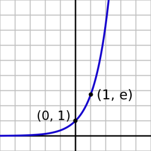
Conversely for positive x, exp(x) is greater than 1 and soon becomes very big as x increases. To see the ‘spreading out’ action, imagine taking a few non-negative numbers on the x axis, say 0, 1, 2, 3 for convenience since they appear on the graph given here. Tracing these numbers up from the x axis to the blue line and across to the y axis, we see that exp(0) gives 1, exp(1) gives approximately 3, exp(2) approximately 7 and exp(3) lies off the scale, at about 20. We can see intuitively that 1, 3, 7 and 20 are more ‘spread out’ than 0, 1, 2 and 3 (the standard deviation is a well defined way of measuring spread). This can be stated succinctly: for positive numbers a>b we have exp(a)-exp(b)>a-b.
When we sum these numbers up, this property can be used to weight bigger numbers. Suppose we have two arrays of numbers, say (1, 2, 2, 2, 2, 6) and (0, 0, 0, 5, 5, 5) and we wish to select the array with the fewest ‘big’ numbers. In this case there is a natural divide between numbers 0, 1, 2 and 5, 6, so we can define 5, 6 to be ‘big’, of course there is not usually such a natural definition. It is clear that (0, 0, 0, 5, 5, 5) has the most big numbers. If we simply take the sums of the numbers, we get 15 in both cases, thus we cannot choose between them. If we sum the exponents of the terms in each array we get exp(1) + (4 x exp(2)) + exp(6) ? 3 + (4 x 7) + 396 = 427, for the second array we get (3 x exp(5)) ? 3 x 196 = 588, indicating that the second array has more big numbers.
The opposite happens for negative numbers: these are ‘compressed’: exp(-1) – exp(-2) ? 0.369 – 0.136 = 0.232, but exp(-2) – exp(-3) ? 0.136 – 0.050 = 0.086, i.e. distances have grown shorter between successive numbers.
You might have noticed that exponents of integers increase by a factor of approximately three each time, i.e. exp(1) ? 3 x exp(0), exp(2) ? 3 x exp(1) etc. so exp(x) ? 3x. In fact they do increase by a fixed factor and this is 2.71…, called Euler’s number e. exp(x) is often defined as ex accordingly and the two expressions can be used interchangeably. e itself is defined as limn??(1+1/n)n, which is to say as you evaluate (1+1/n)n for ever higher values of n, you get successively closer to e, but without ever actually reaching it. The expression might look familiar to anyone used to working with compound interest as Euler was.
The logarithm function is closely related to the exponent. It takes two arguments, we call them a and x. loga(x) = b: read the logarithm base a of x means that ab = x. For example log3(9) = 2 since 32 = 9. Usually the base is not specified in which case we assume it to be 10, or in the case of the ‘natural’ logarithm, written ln, we use base e. No matter what the base (so long as it’s sensible: 0 and 1 are not sensible), log has the same basic shape and properties. Imagine reflecting the exponential curve across the 45 line so that it approaches -? as x approaches 0, passes through (1,0) and gradually flattens out as x approaches ?. Notice that we do not take the log of negative numbers – these are non-real. The important property to note is that where the exponent stretches the distance between positive numbers, the logarithm compresses it. If a and b are positive numbers with a>b then:
exp(a) – exp(b) > a – b
log(a) – log(b) < a – b
Can you spot the relationship between exp and log? Log base e, i.e. the natural log, is the inverse function of exp. To see this write exp(x) = ex = y, then ln(ex) = ln(y) = x from our definition above. We also check that exp(x) > 0 for any x, so ln(exp(x)) is always defined. [note]Formulating examples of such arrays could be an interesting problem: what’s the smallest array with which you can demonstrate this without using ridiculously big numbers? It may be that we have to define a cap on the size of the integer in the array. I suspect that the problem is similar to trying to pay using as many of the coins in your pocket as possible.[/note]
Chris Stapenhurst carried out this work during an internship with the Citizen’s Income Trust in 2013. His work was supervised by Malcolm Torry. The paper uses EUROMOD F5.0+ using Family Resources Survey 2008 data. EUROMOD is continually being improved and updated and the results presented here represent the best available at the time of writing. Any remaining errors, results produced, interpretations or views presented are the author’s responsibility. The process of extending and updating EUROMOD is financially supported by the Directorate General for Employment, Social Affairs and Inclusion of the European Commission [Progress grant no. VS/2011/0445]. We make use of micro-data from the EU Statistics on Incomes and Living Conditions (EU-SILC) made available by Eurostat.